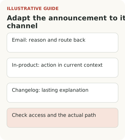
An app update announcement should name an action the reader can take and provide a clear path to it. Email needs a reason to return; an in-product message needs a connection to the task at hand; a changelog needs an explanation people can find later. The three complete examples below are hypothetical. Use them as a starting point after checking your own feature's permissions, data and behavior.
Each example has its own working context. These aren't messages from real customers or proof that this copy will increase use. The screen names, roles and conditions are illustrative. Replace them with verified facts when adapting the copy: a ready-made message can't make an unavailable action available.
Email: ask an administrator to review a setting
Imagine a service for education centers has added reminders for unpaid classes. In the hypothetical account, the feature is already included in the plan, and the recipient is an administrator who can change sending rules. The email could read:
Subject: Set up payment reminders for classes
You can now set up reminders for classes with an unpaid invoice at your center. Open “Payments” → “Reminders,” review the message and sending time, then check the list of classes the rule will apply to.
Reminders will start sending once you enable the rule. Check the recipients before enabling it: the setting applies to the entire center. An administrator can change it.
Button: “Review settings”
The button promises a review, so the link opens settings instead of enabling sends with one click. That distinction matters when the action affects people outside the service. If the rule also requires connecting a channel, name that step before asking the administrator to enable reminders.
This copy doesn't suit a teacher who can view payment status but can't change the rule. Their message needs viewing instructions or a way to contact the person responsible. Check the recipient's actual role before sending and their current access after sign-in. LaunchDarkly's documentation describes gradual releases: a feature deployed to a working environment isn't necessarily available to every account.
Check that the link opens the right center too. An administrator may work in several organizations, and the email may open in the last active session. Naming the organization in the actual subject or message and offering a choice after sign-in can keep the invitation tied to the right settings. Don't promise that the path works until the team has tested it.
In-product message: connect the feature to the current choice
Another hypothetical product helps recruiters compare candidates. A user has opened a vacancy and selected several cards; they have permission to view ratings. A tooltip appears beside the available action:
Compare selected candidates
Open these candidates' ratings and notes side by side. Click “Compare” to check them against the same set of criteria. The comparison doesn't change the original cards.
Button: “Open comparison”
Secondary action: “Later”
The message builds on a selection the person has already made. It doesn't explain the entire hiring system or promise to choose the best candidate. The statement about keeping cards unchanged belongs there only if that behavior is confirmed. If the action shares or changes data, the copy must say so.
You can place this guidance beside the button without a blocking pop-up. If you choose a pop-up, check whether it covers the list, whether the close control is visible, and whether the user can continue with a keyboard. Window size doesn't fix bad timing. A recruiter writing feedback shouldn't have to learn a new comparison method first.
If only one card is selected, it's too early to invite the person to a ready comparison. Explain preparation near the selection or wait for the right state. Stop the introduction after the first working comparison; clicking “Later” shouldn't trigger the same window on every sign-in. Frequency and priority rules are part of the workflow alongside the copy, even though the user doesn't read them.
Changelog: leave a self-contained explanation
The third example is a meeting room booking service. Users can save search filters for their own future use. This news doesn't require interrupting a booking. A permanent entry could read:
Save a meeting room search with the conditions you need
Choose a location, capacity and equipment, then click “Save search” and give it a name. Next time, open it from the saved searches list in “Meeting rooms.”
The search saves your selected filters, not a booking. When you open it, the service checks room availability again for the specified time. Only you can see your saved search; colleagues can create their own.
Button: “Open meeting room search”
The entry answers questions that remain after launch: where to find the saved item and what was actually saved. It doesn't depend on a vanished pop-up. The limit about bookings addresses a possible wrong expectation, so it sits beside the action rather than in a general footnote at the bottom of the site.
The TimelyText guide recommends connecting release entries to the user's work and linking to details. That's the writing service's editorial approach, not a measured guarantee of conversion. This entry is complete enough to get started; separate help would be useful for changing and deleting saved searches, if the product supports those actions.
Check the entry's accuracy when the feature changes next. If saved searches become shared with the team, “only you can see it” will mislead readers. A permanent text needs an owner for its facts. The publication date alone doesn't explain which conditions apply today.
What to change when adapting the copy
| Part of the example | What to check before use |
|---|---|
| Audience | The recipient can actually perform the action in the right account |
| Promise | The button leads to reviewing, viewing or doing exactly what the copy names |
| Preparation | Data, plan and required settings are in place; missing conditions are named in advance |
| Consequences | Sending, sharing and data changes aren't hidden behind “Try it” |
| Completion | The team knows when to stop the introduction and where to find the explanation later |
The choice of channel depends on timing and the task, while release note writing guidelines help you check the facts of the change first. Don't turn every example into an email, pop-up and entry at once: sometimes a permanent explanation is enough.
Check the promise along the recipient's path
Follow the link as the recipient, including sign-in, organization selection and the necessary data. Then ask someone to explain what will happen after they click the button. Correct a mistaken expectation of automatic sending before display, even if the team likes the headline.
Choose a success event for the task: a reviewed and enabled rule, a usable comparison or a saved search opened again. Impressions and clicks are early signs of contact. The broader connection between announcements and feature use helps prevent a read announcement from being declared a completed launch.
Take one example and test it end to end before sending. For a permanent explanation, see the Flowtomate changelog. Start with permissions, the action and the verified result of the transition: attractive copy alone can't supply them.