Onboarding an existing user to a new feature should explain one new work action using a familiar path. Start a short tour when suitable data is available and end it with a verifiable result. The number of windows depends on unclear transitions; there's no need to reintroduce the entire service.
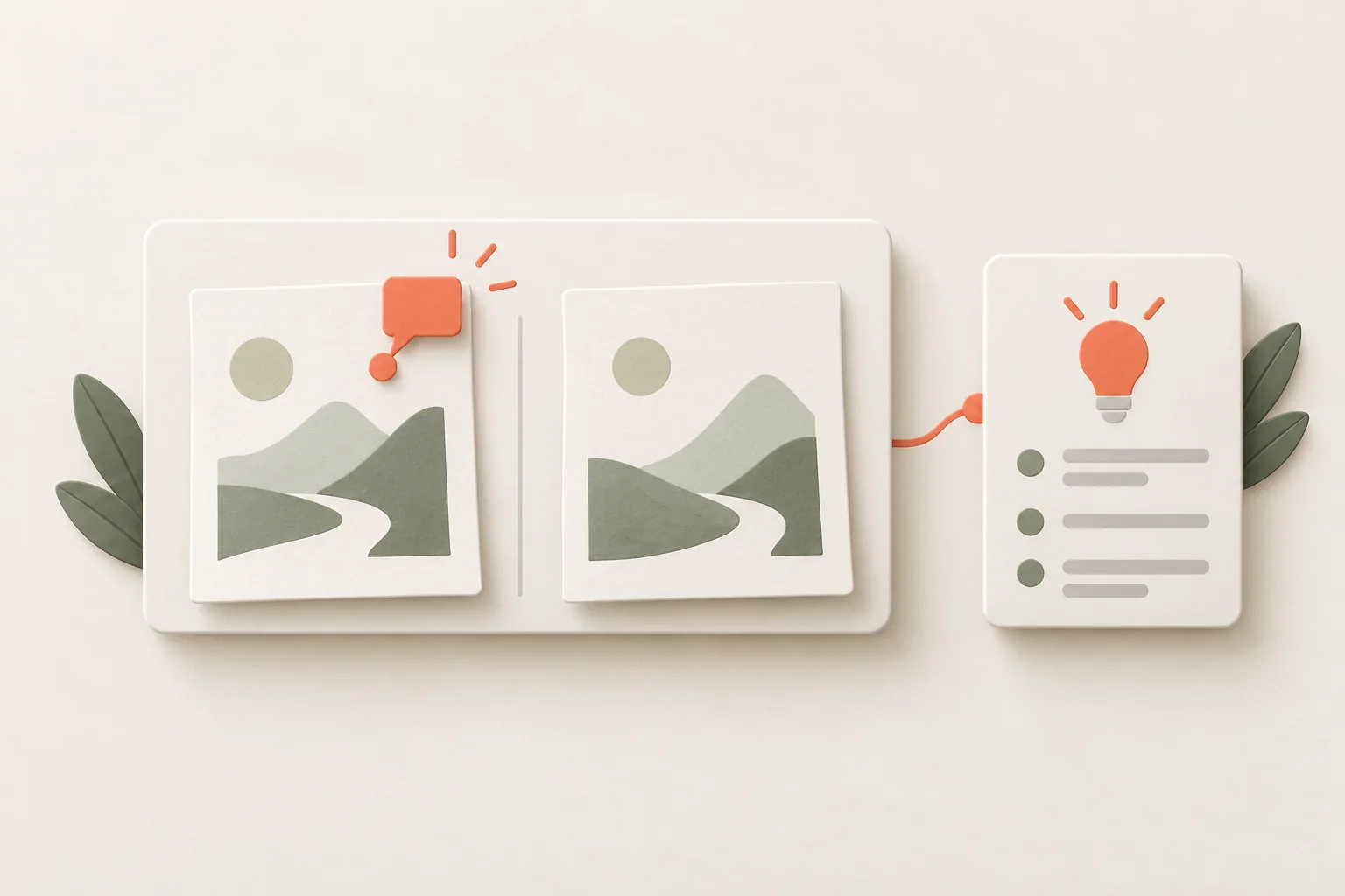
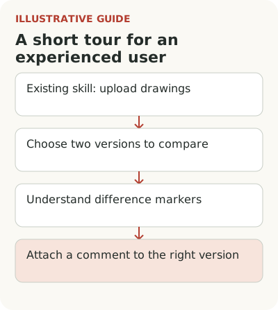
Imagine a service for architecture firms adds drawing version comparison. An architect already knows how to upload files, leave comments and invite colleagues. What's new is choosing two versions, understanding the difference markers and attaching a comment to the right version. They do everything else faster than they can read another welcome message.
What does an experienced user need to learn about the new task?
Describe the old method before building the tour. At the hypothetical firm, the architect opens two files side by side and checks changes manually. The new feature overlays versions on one screen. Explain that difference in the invitation: “Compare the current version with the previous one and mark a change.” The tool's name alone doesn't reveal the action.
Check that the person actually knows the old method. A recent employee may need a different explanation even if the account is years old. Account history and individual experience aren't the same. For an initial launch, a clear signal is enough: the person has worked with multiple document versions or opened comparison themselves.
If suitable data isn't available, offer a voluntary launch at the feature entry point. That's more honest than calling every longstanding customer experienced and automatically showing them the same route. Keep the invitation short: explain the action the tour covers and allow the person to continue working without it. Their choice to learn improves the context.
Choose one tour outcome
The hypothetical tour's outcome is a comment attached by the architect to a change in the right drawing version. Every step should support that action. A tour of the team menu, new profile and product roadmap isn't needed, even if they all shipped in the same release. Other news can stay in the changelog.
Sketch the path without copy: open comparison, choose the second version, read the marker, leave a comment. Then ask where the interface explains itself. If version selection is obvious, a separate window only delays the person. Guidance belongs at transitions where they might misunderstand the result or act in the wrong place.
A Kompassify guide to redesigns distinguishes a tour for existing users from new-user training: it should explain changed areas and preserve a way back to help. That's vendor advice, not a standard number of steps. The same principle helps with a new feature, with one qualification: explain the new way of working, not just button locations.
Walk through the complete short version comparison tour
The hypothetical architect's path can be handed to the tour author as follows:
| Step | Condition or guidance copy | Action and confirmation |
|---|---|---|
| Invitation | A drawing is open, two versions exist and the person can comment. “Compare versions and attach a comment to a change” | The person voluntarily starts the path |
| Choose versions | “The previous version is on the left, the current one on the right. Choose a pair to review” | Selected versions and their names are visible |
| Read differences | “Differences in the selected pair are highlighted. Open the relevant area to check it in context” | The architect finds a specific change |
| Comment | “Add a comment to the current version. Check the document name before sending” | For a real task, the comment is saved on the correct version |
| Exit | Show where to reopen comparison and help | The person continues work; training doesn't restart after the outcome |
If the person is only learning, the path can end before sending a comment. That event indicates a training view; count the real outcome separately. Users who dismiss the tour need a way back to the task and a voluntary restart.
Show comparison where the architect already has two versions. Start the tour on a single file and missing material blocks the useful part. The start condition should check readiness. When data is absent, explain what's needed and suggest returning after another version is uploaded.
Don't make someone create an unnecessary comment to tick a completion box. On a real project that clutters the team's work. Give a safe example or end the explanation before sending if the person is only learning. Distinguish completing the learning path from using the feature on a working document. They answer different questions.
Account for screen variants. The side panel may be hidden, an archived version open, or comment permission absent. The tour must either work correctly in those states or explain in advance why it's unavailable. If a window covers the needed control, the problem isn't the user's willingness to learn.
Close the tour and return to the needed step
An architect may open comparison before a meeting and realize there's no time to learn. Don't treat closing the tour as rejection of the feature. Leave a clear restart command or short help link nearby. The person should choose the time without waiting for the product to decide to teach them again.
After exit, don't show the whole path every time they open a drawing. Store introduction state and account for real actions. If the user has already sent a comment through comparison, a basic tour invitation no longer makes sense. If they started and stopped at the markers, help at that point may be useful instead of repeating step one.
Check focus order, close-button access and visibility of the work control with a keyboard and on a narrow screen. A short tour is still part of the interface. Less text doesn't compensate for a button that can't be pressed or a label that can't be read at increased zoom. Check these states before broad display.
Distinguish completing the tour from using the feature
The share reaching the final window shows how people progressed through the explanation. It doesn't say whether version comparison helped. For the hypothetical service, look instead at completed working actions among people with suitable documents and return to comparison at the next revision. Use a window long enough for the drawing exchange cycle.
See what help people seek after the introduction. If architects regularly ask which version a comment belongs to, the final tour step may look successful despite a misunderstanding of the outcome. Check the meaning itself: ask them to show where a colleague will see the comment and which document will open. For a complex feature, that can be more useful than another window explaining every marker.
Give support a link to the same short path. An answer about the new feature then won't lead to an old general guide. Update the explanation with the work action when the interface changes; otherwise a correctly configured tour will confidently show a route that no longer exists.
Compare people with similar tasks and data readiness. Those who start the tour themselves may already be more interested, so their higher use can't confidently be attributed to training. If a sound experiment is possible, compare guidance with the normal interface. If not, supplement events with observation and state the limit of the conclusion.
Test the path on one pair of versions in a working role. For preparation, see Flowtomate tours and tooltips; start conditions and outcome events require setup. Connect the path to the launch plan and the wider feature adoption journey. If the familiar location of an action changes, use the separate redesign transition map.