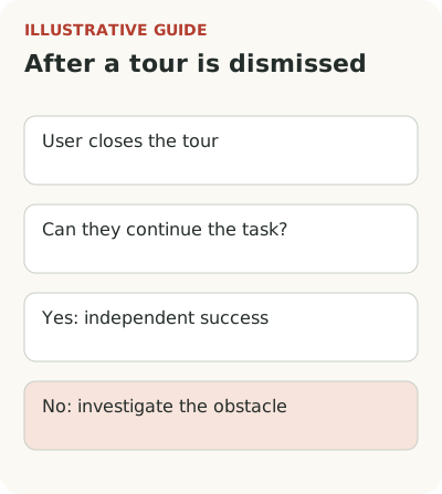
If users dismiss a product tour, first check whether they can continue their task without it. A successful independent path doesn't need fixing. Investigate dismissals followed by lost context, an unavailable step, or a repeated error.
The point of dismissal suggests where to look, not why it happened. The first card may interrupt work; a later step may require data the user doesn't have. Choose a response based on the job and the user's state: move the help, fix its mechanics, shorten the journey, or remove it.
Compare dismissal with what happens next
Suppose a service helps users create sales proposals. A new user enters after a demo and immediately looks for the editor. Instead they see an overview of the menu, team, analytics, integrations, and settings. They dismiss the tour because they already know what they want to do. That is reasonable even if the training-completion chart looks sad.
Another person dismisses the same first card because the tooltip covers the form and the next button is off a small screen. That is an execution problem. A third reads the entire tour but doesn't understand how to turn an uploaded price list into a proposal. That is a content and task-selection problem.
A hypothetical decision tree for a proposal-creation tour:
- Is the draft usable after dismissal? If yes, keep the independent path and optional help. A high dismissal rate alone doesn't require replacement.
- Do people dismiss before the first action and then look for the editor? Check the launch moment. Offer guidance at proposal creation, while keeping the option to decline.
- Do they dismiss at one step where a form is covered or a button is missing? Reproduce the role, screen width, and starting state. Fix execution first.
- Do they read the card but fail to act? Check the instructions, price-list availability, and permissions. Better copy only helps if the operation is available.
- Is work interrupted while waiting for data? Save the draft and offer a checklist of remaining tasks. Don't make people repeat the whole tour after a pause.
If existing customers dismiss a tour after a release, that is a different journey: teaching an existing user a new feature. Don't mix it with first use.
Separate these cases using observations, account state, and entry source. Don't count everyone who dismisses the tour as lost. Look at subsequent actions, errors, and whether they reached a result. Otherwise the team may start fighting successful independent use.
Choose the moment when a question arises
Information about proposal versions helps when someone changes terms for a customer. It may mean little on first entry, before there is a document or a reason to compare versions. User memory shouldn't replace timely help. Explain an action where the person can perform it immediately.
NN/g's research on tours and contextual help covers interruptions, skipped training, and the difficulty of remembering it later. The authors also describe situations where step-by-step training is justified, such as an unfamiliar interaction method. The lesson isn't to ban tours, but to choose the time and form for the task. See the comparison of tours, checklists, and tooltips for that choice.
For the hypothetical service, offer a short launch beside creation of the first proposal. The person chooses a starting template, adds one item, and checks the total. Explanation accompanies those actions. If training starts automatically, make the reason for showing it, the option to close it, and the way to return later clear.
Check each step as part of the job
Compare two cards. “The editor is here” names a location. “Add an item to check the total and appearance of the proposal” explains an action and its purpose. The second allows useful work rather than simply moving to the next rectangle. It shouldn't, however, require sending a document to a real customer for training.
Choose a safe amount of practice. A person can create a draft and view a preview. If an action involves payment, publication, or notifying others, explain the consequences and let them check before confirming. A tour doesn't override normal product rules. Access to working data and participant permissions must stay the same.
Don't guide people through elements that aren't there. An empty account, different role, narrow screen, or changed interface can break a fixed sequence. An unavailable step needs a meaningful end or alternative path. Waiting indefinitely for a button that the role cannot access won't become training after a copy edit.
Let people close help and return to it
Let users close the tour without losing entered data. After dismissal, they should understand where to continue working and where to find help again. If the product starts the same sequence from the first card at the next login, it effectively ignores their decision. Repeat a display for a clear reason, not in the hope that the user will eventually give in.
Save progress to the extent that it represents real work. If a draft already exists, returning shouldn't require creating another. If the user deleted a practice object, explain where they can resume. Distinguish cards viewed from actions completed: they may not match.
Keep an optional overview for someone who simply wants to explore. Offer task-specific guidance to someone with a concrete job. Both can coexist if their names clearly describe the goal. Don't make the general overview a mandatory pass to the editor. A prepared user doesn't have to prove they know the buttons.
Evaluate results for people who complete and skip
Set the main check: the share of new accounts with access to the editor that create a usable draft within the chosen period. Then examine errors, time, and subsequent use. The tour completion rate helps diagnose individual steps, but an increase in that rate doesn't replace an increase in successful work.
Compare groups carefully. People who chose training may already differ from those who dismissed it. A simple comparison of outcomes doesn't prove the tour's effect. If traffic allows, test options on comparable groups; otherwise observe attempts and state the limits of the conclusion. PostHog's funnel documentation helps define the path and measurement window formally.
Check accessibility separately: keyboard use, text visibility, card position, focus, and narrow screens. Guidance shouldn't cover the required element or leave someone without a clear exit. These defects are easy to mistake for refusal to read when looking only at analytics. Reproduction is more useful here than another version of the welcome message.
Also check the launch point after dismissal. A “Help” link may be too general if it contains dozens of topics. Name the specific task: “Create your first proposal with guidance.” People should know in advance what will launch and whether they can use their own draft. This reduces uncertainty without forcing repeat training or promising that choosing the link guarantees successful work.
Open the most frequently dismissed step and ask what action it helps someone take right now. If there is no answer, remove or move it. You can use Flowtomate tours for the resulting journey, but your team still has to define the sequence of useful work.