An accessible product tour lets people find help, control it, and continue their task in the conditions they need: using a keyboard, a screen reader, larger text, or a narrow screen. Check the whole journey. A visible guidance card does not prove that someone can use its controls.
Before launch, walk through the main task with a keyboard, on a narrow screen, and with enlarged text. This is a behavior check. Making the designer's browser window smaller and confirming that the card fits will not cover it.
First, choose the right format: a product tour, checklist, or contextual tooltip. Sometimes a persistent explanation beside a field is easier to use and check than a separate overlay.
Start with the task the guidance must keep available
Suppose a tour helps an employee send their first report. One step asks them to choose a date range; another asks for a recipient. If the backdrop blocks the form while the card tells them to click a button underneath it, they cannot continue. The instruction itself might be perfectly clear.
Agree on what each step does: does it explain something, or ask the person to interact with the product? A window that temporarily blocks the rest of the page needs different focus behavior from an explanation beside an active field. The card's appearance does not decide which interaction you need.
The W3C APG modal dialog pattern describes moving focus into a dialog, navigating its controls, closing it, and returning to a logical point in the task. Those rules apply specifically to a modal dialog. If the user needs to interact with the page behind your guidance, check whether the interaction you chose actually supports that step.
Distinguish a tooltip from a window with interactive controls
A hover tooltip does not suit every instruction. A touchscreen may offer no equivalent hover action, and a keyboard user needs another way to reach the explanation. If someone needs that information to complete a required step, check that they can obtain it in those conditions.
In the W3C APG tooltip pattern, the tooltip itself does not receive focus; content with interactive elements calls for a different kind of component. The page also explicitly describes the pattern as work in progress without task force consensus. Do not treat it as a finished certificate of compliance.
For the product team, the practical question is straightforward: can someone read the explanation and use everything it offers? If it contains a link, button, or form, check its behavior with an engineer and an accessibility specialist. Calling the component a “tooltip” in a mockup does not define how it should work.
Check mobile screens, zoom, and the route through the task
Suppose the send button sits in a desktop toolbar but moves into a menu on mobile. A tour that points straight to it misses a necessary action. Shrinking the card will not fix that. The person needs to open the menu first or have another clear way to find the command.
Check the on-screen keyboard as well. A hint may fit before typing starts, then cover the confirmation button once the keyboard opens. A long recipient name, a multiline error, or larger text changes the height of the content. Use realistic values. An empty form makes testing convenient for the team but reveals little about actual work.
Another language version can also change text length and labels. Use the onboarding localization checklist instead of relying only on short test strings.
W3C's guidance on reflow helps check whether information and functions remain available as the viewing area narrows or content is enlarged. Some kinds of content have exceptions, and assessing the whole product requires separate work. For a guidance card, start with the basics: people can read the text, reach the actions, and understand the message without awkward horizontal scrolling.
Use a product tour accessibility test matrix
For each check, record the action and its outcome. That makes the defect reproducible after the interface changes.
| Condition | Action | Outcome to check |
|---|---|---|
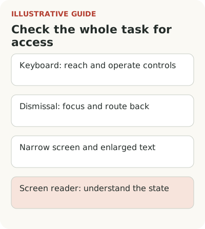
| Keyboard only | Open help, follow a step, and dismiss it | Focus stays visible, controls work, and the task can continue |
| Screen reader | Find the name, read the instruction, and choose an action | The participant understands the meaning and sequence without visual guesses |
| Narrow screen and on-screen keyboard | Fill in a field and save | Guidance does not cover the command the person needs |
| Enlarged text | Read the condition and move on | Content is not cut off and controls remain available |
| Cancellation and errors | Skip the tour or correct a value | Input and a clear way to continue are preserved |
This matrix does not replace a full WCAG audit. It defines a working test scenario for the guidance itself.
One successful demonstration will not cover every condition. For the scenario you chose, a useful walkthrough includes these checks:
- Open and close help with a keyboard, then continue the task.
- Read the instruction with enlarged text and find every action.
- Complete the step on a narrow screen, including menus and the on-screen keyboard.
- Trigger an error and correct the data without losing the filled-in form.
- Check names and navigation order with a screen reader.
- Repeat the key step under a role with different permissions.
When you find a blocker, record the condition and the specific action that failed. “The mobile version is bad” is too broad. “Opening the keyboard makes Save unreachable” gives the team something it can fix. Both the product manager and the engineer can work with that finding.
If the tour has no technical blockers but people still dismiss it, investigate why users skip product tours. Accessibility and relevance need separate checks.
For important controls, check target size and spacing. W3C provides a separate explanation of minimum target size, including its exceptions. The button's visual appearance is not enough: a small close icon beside the main command can invite accidental clicks even in a tidy design.
Recheck guidance when the product changes
Moving a field, adding a menu, or changing focus order can break a tour that passed earlier checks. Include the affected scenario in release verification and name the person who will update its content. A component library can help, but it does not guarantee the right sequence in your product.
The guide to why product tours break after a release explains how to connect these checks to interface changes.
Start with one main route to first value. Have a participant complete it in the relevant conditions without explanations from the team. Check whether they can finish the whole task. Tour completion alone will not tell you how many people abandoned the guidance because they could not use it.