
To build a user onboarding checklist, choose one working result, break it into necessary tasks, and define a completion condition for each. A task should be checked off when readiness is confirmed, not when a form opens. Watching a video and completing a profile belong on the list only if the chosen work cannot be done without them.
Below is a hypothetical checklist for preparing a booking page, with criteria, destinations, and handling for later changes. The task determines the list's length. Attractive progress percentages can wait: first define what progress means.
Name the result the checklist promises
Suppose a product helps people arrange consultations. The first journey is to publish available times and make it possible to accept a valid booking. A checklist might cover creating a meeting type, setting available hours, checking the page, and publishing it. A company logo or reading every payment option isn't essential yet.
Clarify where the checklist's promise ends. “Start working” is too broad. “Prepare your booking page” is more precise if an actual booking depends on an outside visitor. Don't promise a customer when onboarding can only make the page usable. Track the next event separately.
If the product serves several jobs, don't combine them into one mandatory list. A consultant who already uses a calendar elsewhere may start differently from a new team's administrator. Let people choose the work that fits or show a list based on available context. In a new section, an empty state can provide the entry point. There's no need to make everyone learn every way to use the product.
Define tasks and completion criteria
“Complete settings” explains neither the scope nor the goal. “Set the hours when people can book you” connects a setting to a customer's future action. “Watch training” describes consuming material. If the material is needed for a step, connect it to that step and leave it available as help on request.
Each task needs a clear action, a short explanation when necessary, and a link to the right place. Don't send people to a section's home page where a newcomer still has to find the form. After saving, let them return to the list with its state intact. A checklist shouldn't require them to remember their way back.
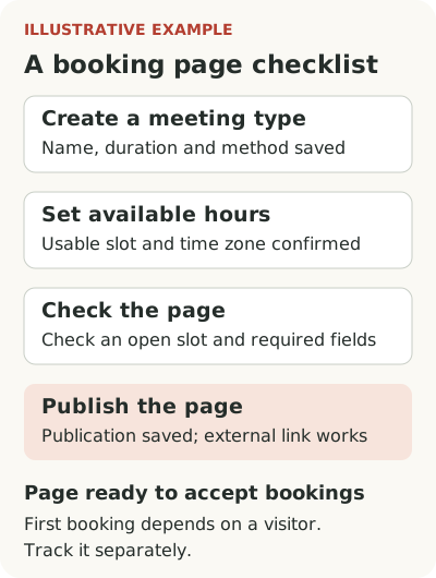
A complete hypothetical checklist for “The page is ready to accept bookings” could look like this. It doesn't promise a first customer; that depends on a visitor.
| User task | Completion criterion | Destination and what happens if undone |
|---|---|---|
| Create a consultation type | Name, duration, and meeting method are saved | Meeting-type form; deletion reopens the task |
| Set available hours | At least one usable slot exists and the time zone is confirmed | Schedule; if all hours are deleted, show why the task is incomplete |
| Check the page as a visitor | The product's available check of an open slot and required fields is completed | Preview; a manual checkoff is acceptable if the system can't verify everything itself |
| Publish the page | Publication is saved and the external link opens a working page | Link check; disabling publication makes the task require action again |
Add branding and a payment method only for journeys where they are required before booking. If prepayment is mandatory, payments are no longer optional. For an invited administrator, some conditions may already be met: the list should read existing state rather than require repeated setup.
NN/g's help guidance recommends content grounded in tasks and concrete actions. That applies to checklists too: instructions help when they support the work. Their existence alone doesn't prove they are needed at every step or by every person.
Mark readiness from product state
A person clicked “Set up schedule” but closed the form without saving. The task isn't complete. They saved hours but left a conflicting time zone. A formal record exists, but the result may be unusable. Choose a completion condition that reflects the readiness actually needed.
Where the system can confirm success itself, use that state. A user shouldn't have to check off “Added hours” manually if the product already stores the schedule. Manual confirmation is sometimes unavoidable for external actions, but explain what it means. If help is needed within one action, compare a checklist with a tour and tooltip. “Checked the link with a colleague” isn't the same as a booking confirmed by the system.
Plan for changes in the other direction. If the schedule is deleted or publication disabled, a task may become incomplete again. Show why so the person doesn't think the service lost their progress. Also distinguish waiting for an external event from an error. “Page published, waiting for the first booking” is clearer than a frozen ninety percent.
Keep optional work out of mandatory progress
A checklist can have several paths to a result. If a calendar can be maintained manually, connecting an external source isn't mandatory for everyone. If payment comes after the consultation, setting up a payment method shouldn't block the page. State which tasks the chosen journey needs and which extend it.
Let people hide the list and find it again. If someone dismisses a product tour, a list can sometimes preserve the plan, but it won't fix an unavailable action. The user may understand the work better than the assumed newcomer or may simply have a different task. NN/g's contextual help article identifies the ability to close and reopen help as a separate condition. For a list, this preserves control and doesn't force people through training to gain access.
Don't add artificially completed tasks just to make initial progress look attractive. If registration is already complete, you can show it as a fact, but it shouldn't hide the real work remaining. Explain what publication requires instead of promising an almost-ready result before a long calendar and permissions setup.
Check the work after the list is complete
The main measure is the share of eligible new accounts that prepared a usable page within the chosen window. Alongside it, consider time, errors, return after a break, and use of the page for its intended purpose. Checklist completion helps explain the journey but doesn't replace checking the result. Specify which accounts had access to each required action.
Study people who reached the end but didn't use the result. Perhaps visitors can't understand the page, the link isn't accessible externally, or the customer doesn't know where to place it. This may be the next task, but the list shouldn't claim a full launch if its result cannot be used.
Also check those who obtained the result without the list. If there are many, don't force them back to collect checkmarks. Reflect the achieved state automatically where you can confirm it correctly. Users don't have to follow your sequence when they have successfully used another working path.
Assign an owner to the list and a condition for revisiting it. When the publication form changes, check task names, links, and completion rules with it. An old task might still point to a deleted screen or require an action the product now performs itself. This is particularly unpleasant for a newcomer, who may assume they failed to understand when the instructions are simply outdated. Include content maintenance in release work instead of waiting for the first support request.
Before launch, walk through the checklist with a new account, then interrupt each step and return later. This can reveal lost drafts, false checkmarks, and links to general sections. Start with one list for one job. If you need a way to show it in the product, look at Flowtomate checklists after defining the readiness conditions themselves.