
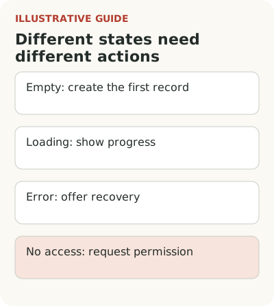
An empty screen after signup should explain why it is empty and offer an action available to that particular user. In a new workspace that may be creating the first record. Loading needs a status and an indication of the wait; an error needs recovery; missing permissions need an access request. A single “Get started” button cannot replace these states.
First distinguish a genuinely empty state from an error or an access restriction. Then write specific copy, explain the object that will appear, and test the full transition through to saved, usable data.
Distinguish missing data from loading and errors
Suppose a manager signs up for an equipment tracking service and sees an “Assets” section. The workspace may be new, or a fleet of devices may already exist without access having been granted yet. In the second case, “Add your first asset” risks creating duplicates and sends the person to do someone else's work.
The examples below are hypothetical. Use them as a copy framework for an “Assets” section after checking the product's actual rules.
| State | Screen copy | Action |
|---|---|---|
| New workspace | “Your equipment, owners, and service dates will appear here. Add your first device; you'll need its name and inventory number.” | “Add device,” with “Import list” nearby |
| Import in progress | “We're processing the uploaded list. The result will appear here after validation.” | Show the operation status, not another upload |
| Import incomplete | “The list wasn't processed. Check the file format; the result of the previous attempt is available in import history.” | Open the specific error and an allowed retry |
| No viewing permission | “You need access to this section. Contact your workspace administrator.” | Request access if product rules allow it |
Only promise import history if it exists. If the system doesn't know the processing result, the message should say what's unknown and how to check the operation. A form error needs its own guidance; don't hide it behind new-workspace copy.
Check which state the system actually knows. If loading is underway, show progress or at least that the user is waiting. If a filter returned no results, offer a way to change it. If permissions prohibit viewing, explain the restriction and how to request access. Don't present an unknown as an absence of data.
The NN/g guide to empty states discusses the error of an interface first reporting no records and then loading them. The recommendation concerns visibility of system status. It is especially useful for newcomers, who don't yet have experience to recognize an inaccurate message.
Write copy for the first object
For a new workspace, explain what the future record represents. For example: “Your equipment, owners, and service dates will appear here.” This gives the person an idea of the result. “Create an entity to begin” communicates only the developer's internal model. It won't help the user much.
Add a small example if the object name doesn't make its structure clear. You might show a hypothetical laptop card with an inventory number and owner, clearly labeled as an example. Don't mix a sample with real data or create it in a way that later requires cleaning up the workspace.
The choice between a sample, tour, and tooltip depends on the question at the action; see the comparison of guidance formats. Consider whether a sample is needed at all. A simple task list may only need a good name and a direct create button. In a complex contract or equipment system, an example can explain relationships between fields. Choose the format for what people don't understand, not to fill blank space in a mockup.
Choose actions for the amount of data
Someone with a small fleet can add the first asset manually. Someone moving a large register needs an import. Make the main choice clear for the situation: “Add device,” with a quieter “Import list” link nearby. Don't make people import one record or enter hundreds of rows by hand.
Explain the cost of the action before the transition: which details are needed, whether a draft can be saved, and whether administrator access is required. If the register must be transferred, check the first upload conditions in advance. If the first card can be created with a name and owner, don't promise complete asset tracking after one click. An honest description of a small result helps more than a vague “Start managing assets.”
Check where the button leads. If it opens a complex wizard without the necessary materials, the empty screen merely moves the stopping point. A useful start ends at least in an understandable intermediate state: the card is saved, missing information is visible, and the person knows what to do next. Allow incompleteness only where it won't cause a tracking error.
Show the next step with permissions in mind
A user invited to view their department's equipment may not have permission to create assets. They need different copy: who adds the data and how to request the relevant section. Don't show an active button that will inevitably end in a denial. And don't suggest they grant themselves wider access if that decision belongs to the workspace owner.
For an administrator, it helps to show preparation status: data hasn't been imported, invitations haven't been accepted, or field mapping awaits review. An empty screen can describe the state of the overall work, but it should separate personal tasks from colleagues' actions. “You haven't added anything” sounds strange when the person is waiting for an accounting export.
Don't reveal information in a message that the role shouldn't see. Even the number of hidden records may conflict with the product's access model. Match copy to actual visibility rules. The explanation should help people continue without disclosing unnecessary details about others' data or the customer's internal structure.
Check the first usable record after the transition
The main check is whether new users in the chosen journey can create or access their first usable object. Set a window from the first opening of the empty section, separate new workspaces from those already configured, and account for permissions. Clicking the primary button is an intermediate event because the form can end in an error.
Look at what happens after the form is filled in. If someone creates a random object, doesn't understand its purpose, and deletes it, the screen didn't solve the problem. If an import brings duplicates or records without owners, a quickly populated table doesn't mean success either. Check the quality of the first data and the next working step.
Ask a newcomer to explain aloud what they expect after the action and which information they need. This is a simple copy check before a broad launch. Then compare comparable groups and record the limits of the observation. You can't attribute growth to the empty screen alone if you also simplified import or started attracting better-prepared customers.
When the result requires several actions, keep them in a checklist of working tasks. The empty state usually disappears after the first record. Make sure the only explanation of import or access to examples doesn't disappear with it. Someone may need to return for the next set of data. The main path should remain in the normal interface under the same clear name, and help should be available on request. Otherwise a successful first attempt can unexpectedly make the second harder.
Check one section from scratch, then open it again after a first error. If both states show the same “Nothing here yet,” start by separating them. You can consider a contextual tooltip in Flowtomate to explain a specific next step, but the product's underlying state should remain clear without it.