To write an interface tooltip, name the action, required condition, and result the person can expect now. Start with a question from a specific work situation, investigate its cause, and compare the copy with the screen. Plain wording helps when it resolves uncertainty. Replacing an internal term with “easy” doesn't do that.
You can find user language in support requests and observation, but copying phrases isn't enough. Understand the situation, preserve accuracy, and name an action the person can take now. A good tooltip answers a specific uncertainty. Conversational words alone don't make it useful.
Before writing, choose the place and format: tour, checklist, or tooltip. Don't hide a long sequence in an explanation for one field.
Where to find wording for tooltips
Suppose a team wants to fix a tooltip on a product-import screen. It doesn't need to study every request from the past year immediately. Take cases where users reached that screen, tried to upload a file, and stopped. First messages, follow-up questions, and how support ended are useful.
In a discussion of support-led discovery, Oleg Sotnikov highlights the difference between a general ticket tag and a description of a specific difficulty. One category can contain different causes. That distinction matters for copy: a tag name doesn't tell you what answer someone needs.
Record the original phrase, step, and expectation. If someone asks about file format, don't reduce it to a general conclusion that import is difficult. Perhaps they don't know which columns are required; perhaps they uploaded the right data and got an unclear error. The tooltips will differ. Investigate the circumstances first.
If a situation keeps recurring in support, first review repeat requests. Their cause may require changing the operation itself.
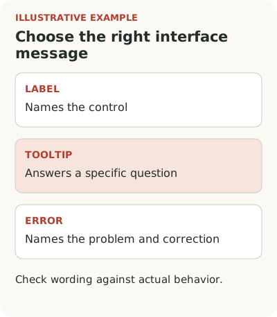
How a tooltip differs from a label and an error message
In the hypothetical example, some users don't understand “field mapping.” Explain it through the action: choose which file column contains the product name and price. But if the service doesn't show columns after upload, the problem is behavior. Friendlier copy won't bring back missing data.
For each recurring question, check whether the person lacks knowledge, confirmation of an outcome, or a working path. If they aren't sure the file was saved, the answer should show upload status. If they lack permission, they need a clear restriction and next step. “It's easy” is irritating in both cases.
There can also be an internal contradiction. Documentation calls an object a project, the form calls it a workspace, and a tooltip calls it an account. Don't choose a different attractive synonym for every text. Agree on the name and check the whole scenario. Users should recognize the object as they move between screen, email, and support.
In Kontur's interface writing guide (in Russian), a field label and tooltip have different jobs: one names the data, the other helps explain input. The guide suggests removing a tooltip that repeats the label. That's one team's editorial rule, useful to test on your own form.
Once an error has happened, the answer needs a cause and correction. Examples are covered separately in form error guidance.
Tooltip examples: replace a general phrase with an action
The hypothetical service below accepts a product table, maps columns, and shows a preview before writing data. The examples fit only that behavior.
| Weak wording | Specific alternative | Check before publishing |
|---|---|---|
| “Perform mapping” | “Choose the file column containing the product price” | The field name and column list match the form |
| “Upload a valid file” | “Upload a CSV with name and price columns. A sample is available here.” | The format, required fields, and sample really match |
| “Continue” | “Review data before import” | The next step shows a preview and doesn't write products yet |
| “Success” | “File uploaded. Check column mapping before importing.” | Upload finished and review is still available |
These aren't universal ready-made texts. A good replacement explains exactly the step your product has. If the list of conditions is long, put it in an accessible standalone block, not a disappearing placeholder.
The YooMoney team, in an account of redesigning B2B onboarding (in Russian), describes the gap between familiar product terminology and how users understand payment acceptance methods. The team rebuilt the first step around questions about the business and how it works. That's a specific scenario change; there is no basis for transferring its result to another product.
Use the approach to question your own copy: must a customer know our product's internal structure to begin? In the hypothetical import, they don't need to learn the word “mapping” first. They need to connect a column in their table to a recognizable service field. The term can remain where experienced users need it, but explain the first action directly.
Don't cut meaning for brevity. “Upload a file” is insufficient if only a particular format is accepted and price is required. Show the condition or an available example next to the action. Copy should answer a real question. Character count matters for the screen, but doesn't ensure complete instructions.
Match the tone to the situation. Someone who has already encountered an error several times doesn't need cheerful praise for trying. They need the cause and an available fix. At first introduction, briefly explain the step's purpose; after a repeated error, name the specific field. One text for every state saves editorial work but may leave the user without the needed answer.
How to check tooltip copy before launch
A useful explanation has an object, action, and sufficient condition. Sometimes it also needs the consequence. Suppose the user selects the price column and the service then shows a preview before import. If no preview exists, don't promise one. Accuracy matters more than a pleasant tone.
Use a short checklist:
- The person understands what the tooltip refers to on this screen.
- The button name matches what they see in the product.
- A required condition appears before an action that cannot succeed without it.
- After clicking, what happens matches what the copy led them to expect.
This doesn't require longer text. Often it's enough to replace a general label with a specific action and remove information not needed now. Keep detailed instructions available on request. Don't try to fit all documentation into one small window.
For several languages, add a localized onboarding check. The translated button and tooltip should name the same action consistently.
Let the user take the step without a team member translating it
Show the screen to someone who doesn't know the internal names. Give them a real task with test data and watch what they do after reading. “Is it clear?” yields a weak answer: agreement is easy. Action shows whether you understood the instruction the same way.
If a participant selects the wrong column, ask what they expected and why. They may have read the tooltip correctly but found the table itself unclear. Record that separately. The goal is to understand the difficulty, not prove new copy is better than old.
For a quantitative comparison, define one outcome: for example, successful import of valid data among people who started in an available mode. Account for errors, cancellations, and help requests. If a different customer type arrived after the copy changed, comparing periods won't show its separate effect. Even a small edit needs an honest conclusion.
Start with one recurring question and one tooltip. Keep the customer's original wording, propose precise copy, and test the action on screen. In the Flowtomate tour and tooltip editor, you can prepare guidance for such a step. Deciding what to explain and whether the scenario itself works remains the product team's responsibility.